
Interos Risk Scorecard

Interos is an AI B2B tool that monitors risk within the customer’s supply chain. The company profile provides a high-level overview of a company, as well as a deep dive into its risk data. The value of the product is dependent on the value of the data it provides.
I was the lead designer
Worked daily with PM
Spoke regularly with engineers on feasibility, implementation support, design QA
Worked with UX researcher to validate concepts and usability test
Interfaced with data scientists providing risk data
Synced with two other designers for feedback
My Role & the Team
Overview
Risk analysts, procurement managers, and supply chain analysts need to easily navigate the company and risk profile, as well as clearly understand the data presented, in order to assess the risk of companies either within their supply chain or that they’re vetting for new business
Problem Statement
Provide a high-level overview of a company’s risk
Enable user to drill down and digest four tiers of data
Show rich granular data with actionable insights
Position Interos as a trusted leader in the supply chain industry
Product Goals
Risk managers & analysts
Procurement managers
Supply chain analysts
Third-party consultants
Compliance officers
Users
Customers satisfaction; they can easily navigate, understand and trust the data
Company wins new business deals by providing a seamless and valuable data-rich workflow
Success Metrics
Use Cases
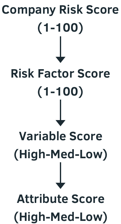
Data Hierarchy

Vetting New Supplier
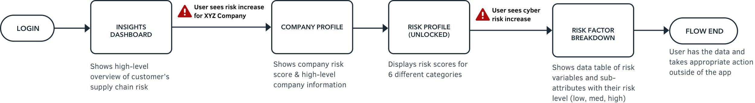
Monitoring Risk
Legacy Platform
No design culture; interface had never been updated
Legacy features and language weren’t clear to the users; transparency is key to earn customer’s trust
Promised customers richer data to produce actionable insights
Needed a more useable and scalable UI to display more data and acquire new business


Concept Ideation & Validation
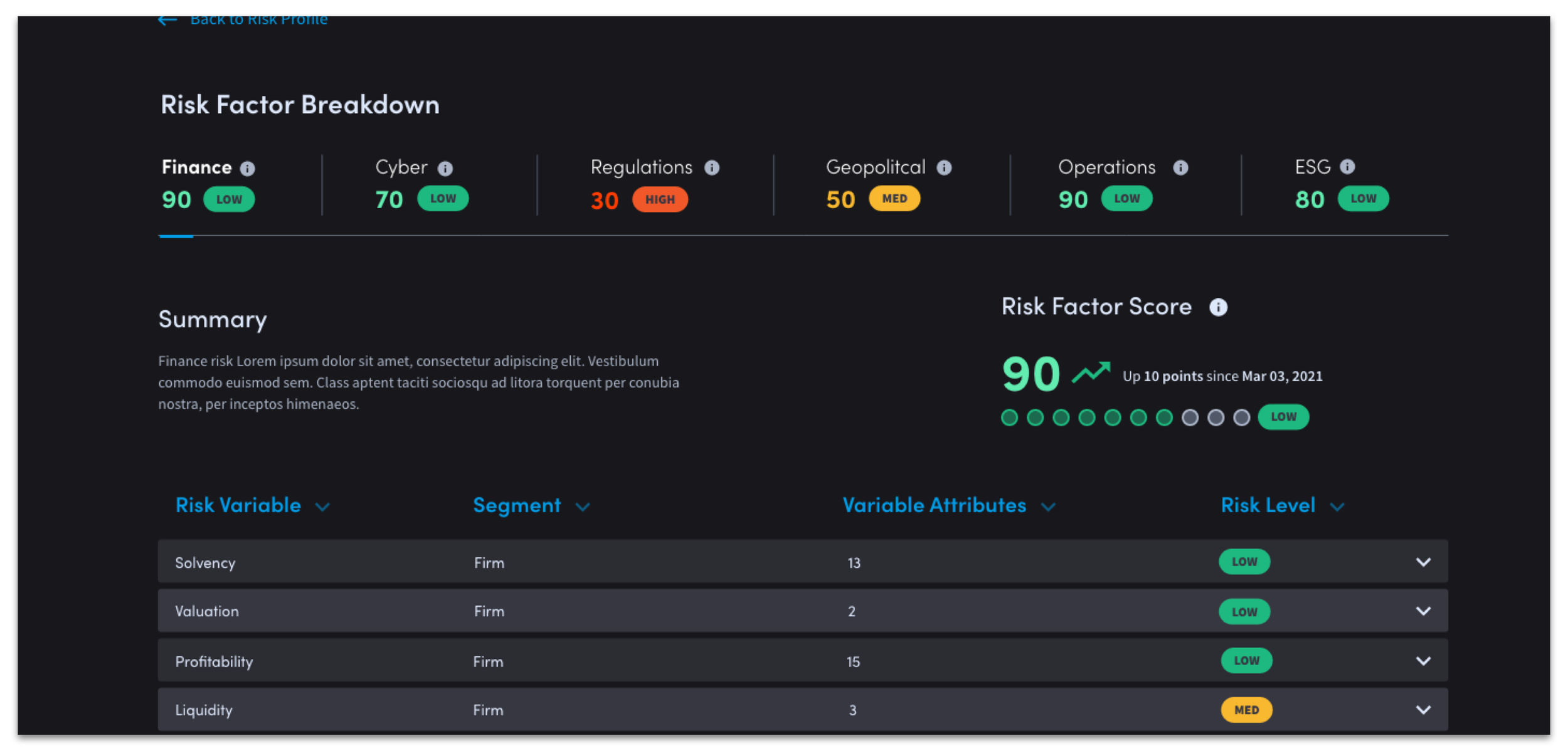
Drilldown through three tiers of data
Recognizable stock ticker pattern
Validated through testing
I pushed for breaking out the design into deeper pages for scalbility
Confusing IA and visual heirarchy; having everything on one page was crowded and hard to digest
The team wanted the scores to be omnipresent but it made for duplicative/redundant info
Secondary nav with both Overview and Risk factories was confusing & redundant
Design not scalable for future content
Working UI was not standard dark design practice (i.e. darker foreground, lighter background)
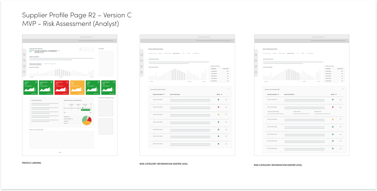
First Iteration
Ideation

Second Iteration & User Testing
Strengths
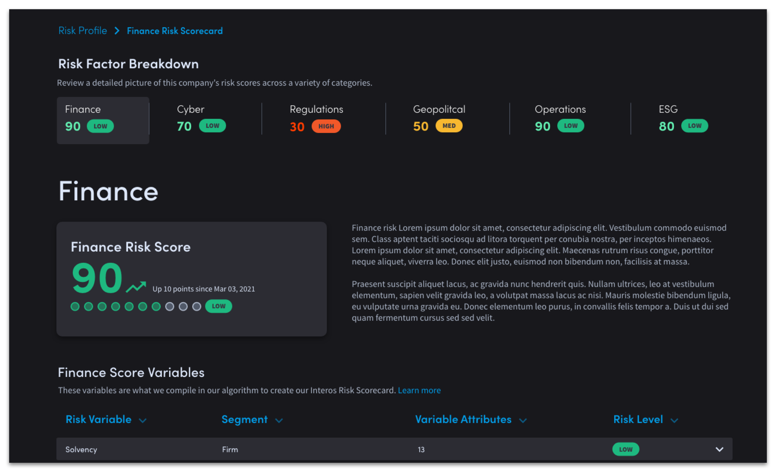
Updated dark design patterns
Broken out into deeper level to offer context and clear presentation
Modified the secondary nav pattern to include the risk scores
Customers were easily able to navigate through and understand the data
Issues
Expanding still table not scalable enough; too many attributes
Data & Eng team informed us they would not be able to show accurate time stamps
Customers wanted more context on scoring breakdown
Customers expressed concerns over data accuracy and sourcing

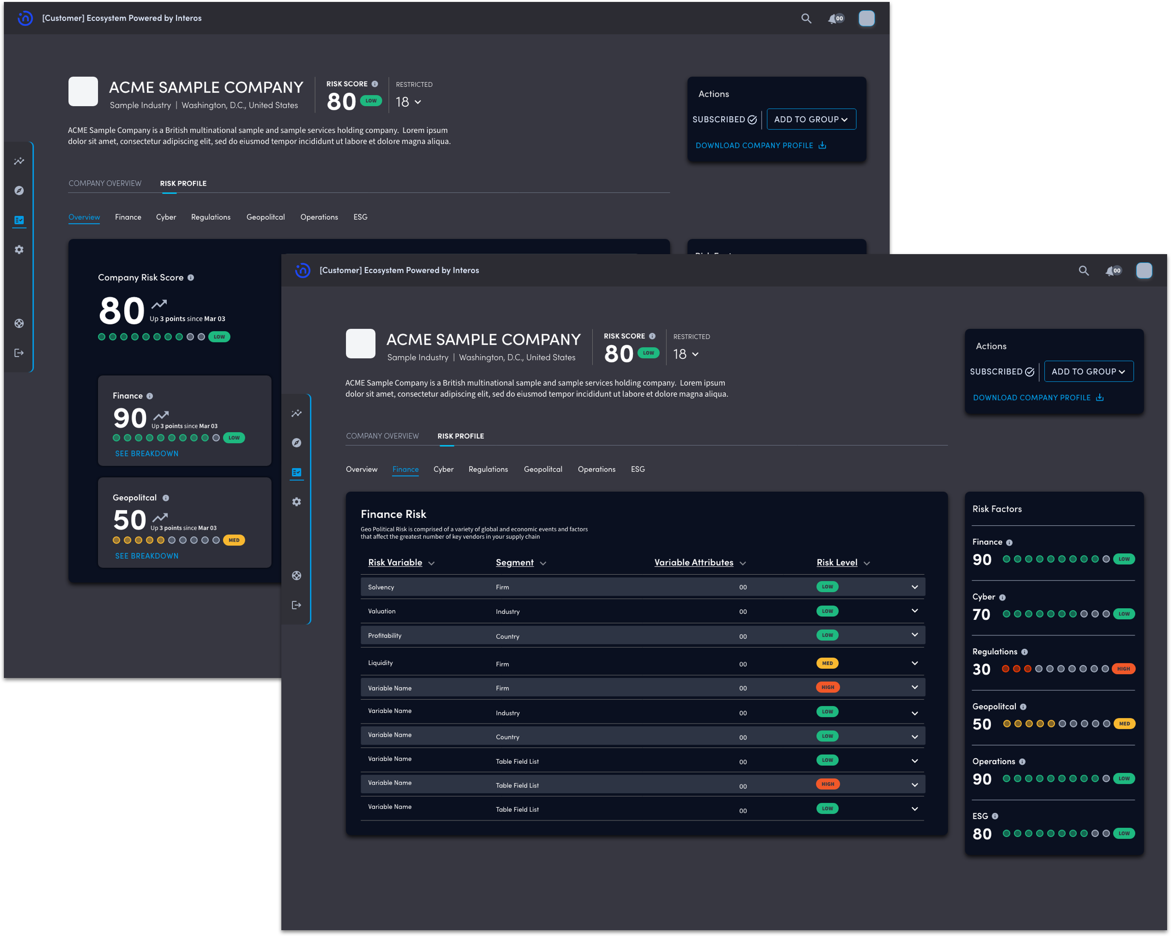
Final Iteration
& Prototype
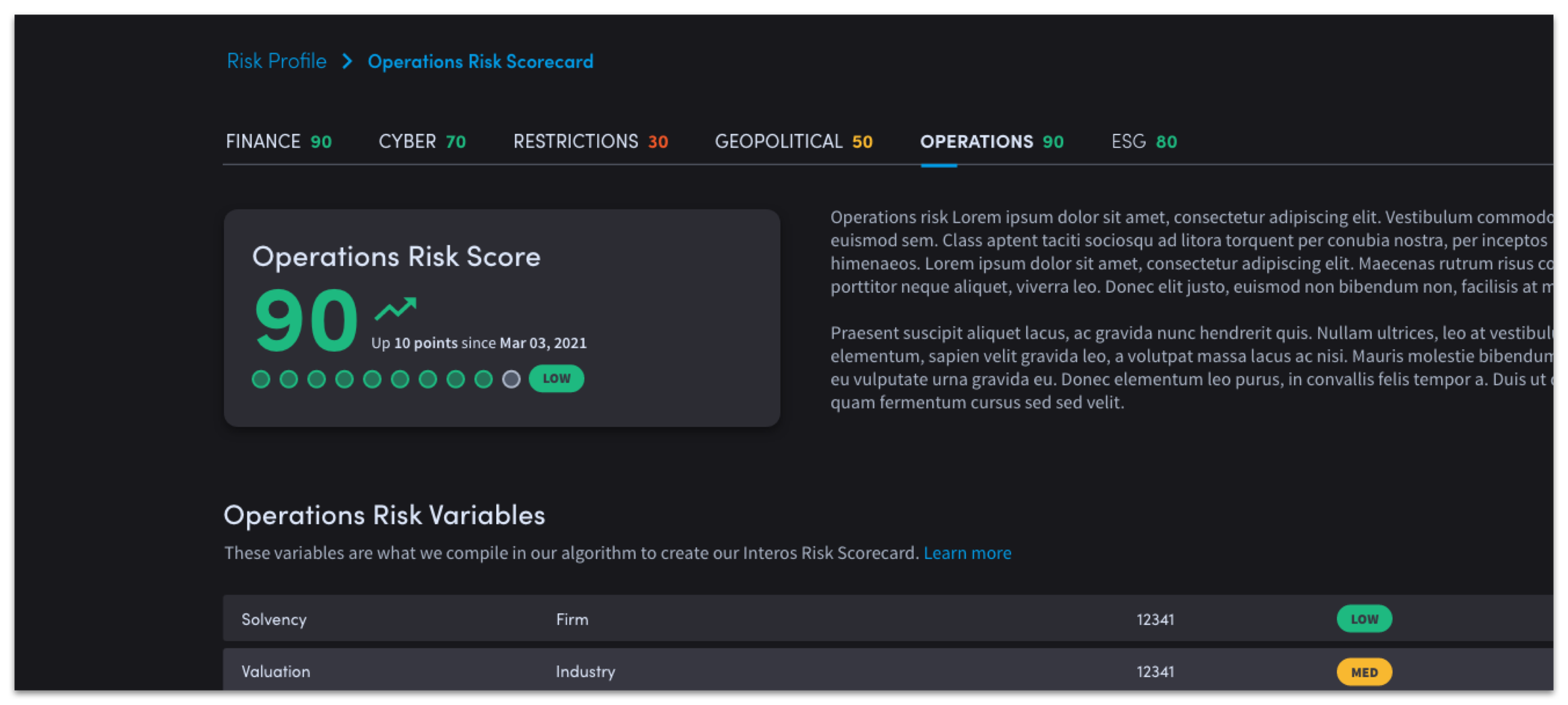
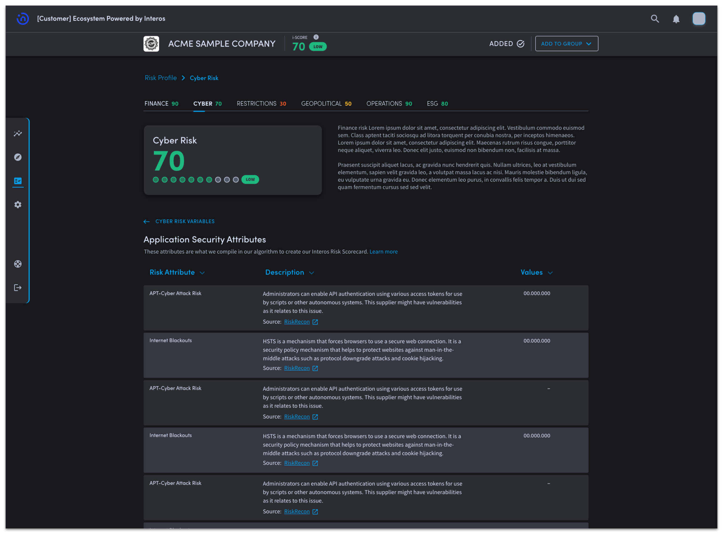
Deeper level of table reveals more information on attributes and is more scalable
Sticky header to reproduce company context and main CTAs
Easy lateral navigation between risk factors with risk scores in context
Easy navigation through the tiers of data
Information stays within Risk Profile Context
More space for the platform to scale and include more data
Looking Back
Impact
A post-launch survey was sent to customers to measure perceived usability & usefulness. The MVP showed an increase of 10% on the System Usability Scale.
What would I do differently?
Push harder on defining the data content in the early stages
Done discovery research with customers; collected data to inform the initial designs
Moving Forward
Work towards getting accurate time stamps
Add back in trending arrows and graph
Scale to include more risk metrics
Pull in news stories about events that affect the company risk data
Conduct research and design a mobile companion app post-launch survey was sent to customers to measure perceived usability & usefulness.
