Sumday Investments

Sumday is a subsidiary of BNY Mellon which provides an investment platform to host the investment plans of its clients. The clients are college savings plans and ABLE savings plans.
I was the lead designer
Met with Head of Design for feedback
Met with PM, business analyst, and engineering for feedback and feasability
My Role & the Team
Overview
People who invest their money in the plans hosted on Sumday need to be able to easily see their overall financial performance, as well as open new investment portfolios from their phone.
Problem Statement
Optimize for mobile useage
Provide a clear high-level overview of overall performance
Enable user to easily open new investment portfolios
Scale to display high number of investments portfolios
Product Goals
Parents investing for their child’s education
Adults investing for their own education
Adults with disabilities investing for their future
Parents of children with disabilities investing for their child’s future
Users
An increase in % of new investments
An increase in % of transfers done on mobile
Decrease in support calls to call center
Success Metrics
Before
Was not mobile-first despite a 60/40% split among useage
Heirarchy was off; performance graph pushed to the bottom by investments
No way to invest in a new fund under “Investments”; user must go to Transfers
Portfolio tiles don’t scale well when user ads more than three
“Add money” links on each portfolio were redundant; they took user generic Transfers section

Process
How does the current design scale for mobile?
What existing patterns and components could be leveraged?
What required new patterns?
Site Analysis
Comparative & Competitive Analysis
Looked at investment apps to see how they treated similar experiences from a UX & visual standpoint
Betterment
Wealthsimple
Stash
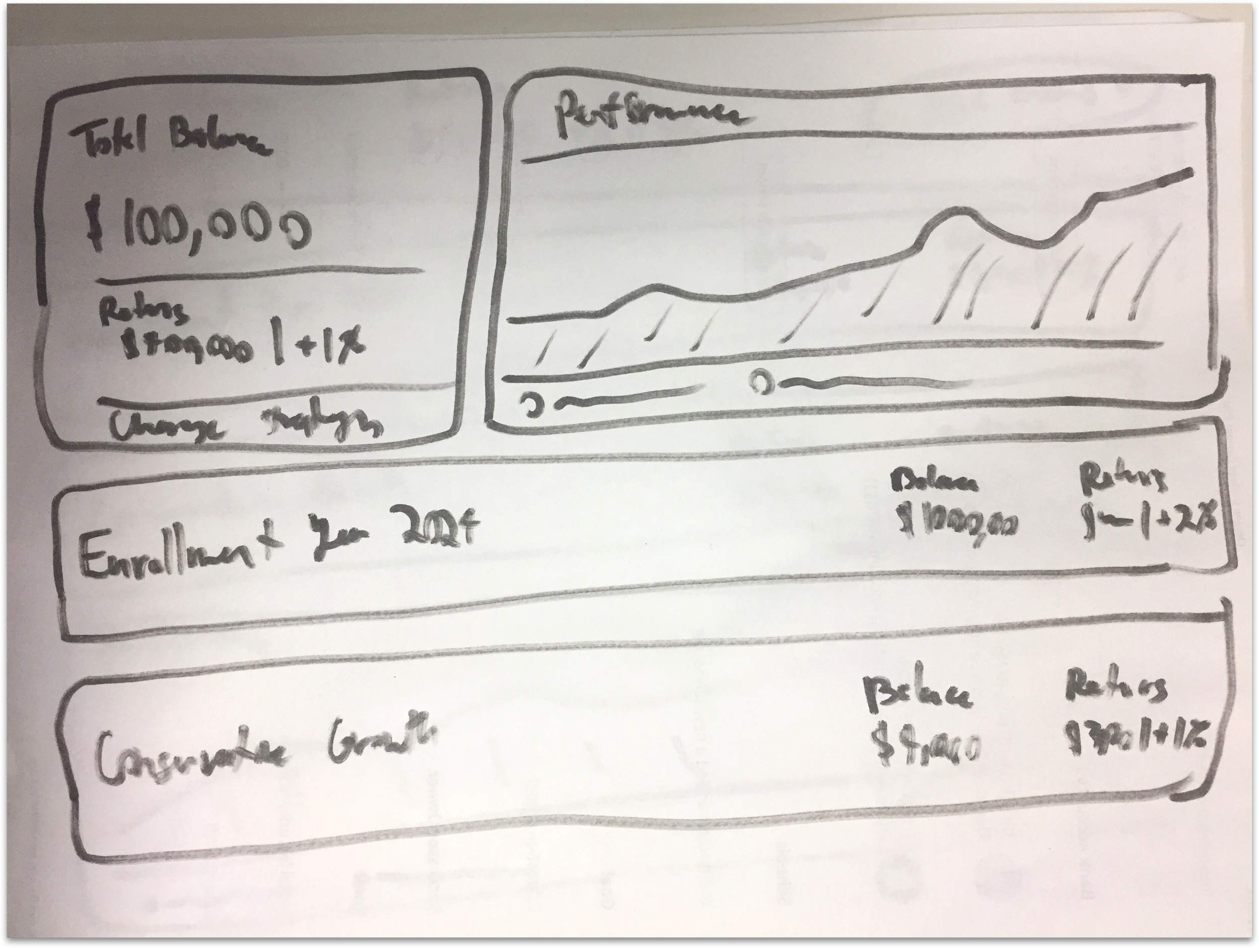
Designs went through multiple iterations from sketches to a click-through prototype. I was
I was the sole designer but synced with design head, PM, business analyst, and engineers routinely
Design & Iterate
Final Iteration
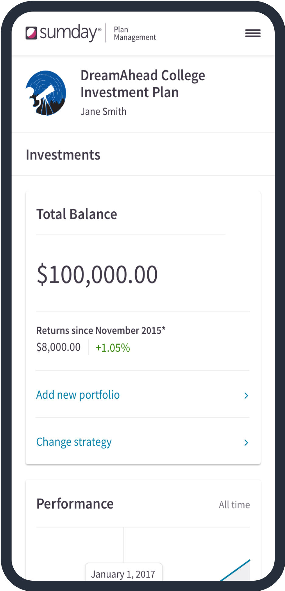
Cleaned up information hierarchy; performance on top, invesmtnets on bottom
Redesigned investment tiles for scalability
Cleaned up language and added in new investments flow which stays with Investments tab

Looking Back
What would I do differently?
I would have liked to been able to user test the previous design and this design
Spent time iterating on the account sub-head which takes up a lot of real estate