Online Ordering
Cents is a SaaS platform powering laundry businesses across the US. The consumer ordering experience is a white-labeled app laundry businesses run as their own branded online storefront. When I joined, I became the owner of that consumer experience and the B2B configuration layer behind it. Over three years I reduced a 6-step conversion funnel to 3, redesigned the system for flexibility and scale, and shipped a cart-based overhaul that was user tested before launch via Strella AI-moderated sessions.
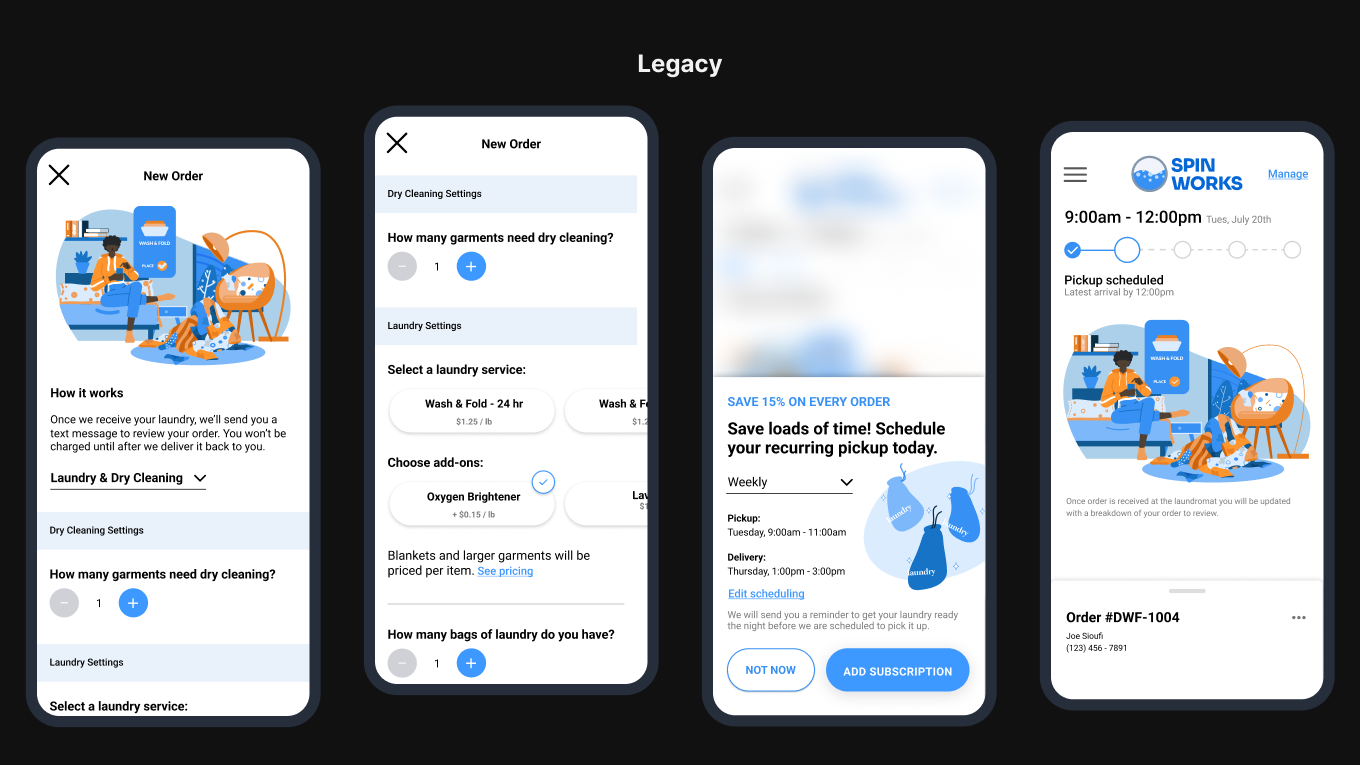
The ordering flow I inherited was designed around the system, not the user. Six pages of decisions, in the wrong order, with patterns that didn't belong on web. Users were prompted to select a pickup time before they had even chosen their services; the flow led with a scheduling decision before the user knew what they were scheduling. From there, a separate screen asked whether they wanted to schedule delivery now, when the order was ready, or pick up in store. Then another screen for the actual time selection. A popup interrupting the flow to ask about recurring orders. Six steps of friction for what should be a straightforward conversion. On top of the logic problems, there were web-specific issues: a bottom sheet component that required users to physically swipe up on a desktop browser. Patterns lifted from mobile that were detrimental to a web experience. When I joined, there was no instrumentation in place to track conversion and user behavior. Decisions were made on instinct and customer feedback, which meant improvements were real but hard to quantify.
My Role
I was the lead product designer for the consumer ordering experience and the operator-facing configuration tools during my time at Cents. I owned both sides of the system; what end customers see when they place an order, and what laundry operators configure on the back end to make it work for their business. I worked closely with a PM and a few engineers throughout.
Reordering the Logic
The work happened in layers over three years, each iteration removing friction and reordering the logic to match how users actually think about placing an order.
The first major change was moving service selection to the first step. Users needed to know what they were ordering before making any decisions about timing. Everything downstream of that shifted accordingly.
Auto-Schedule
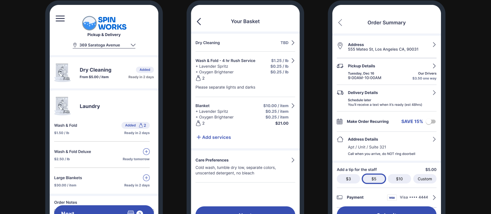
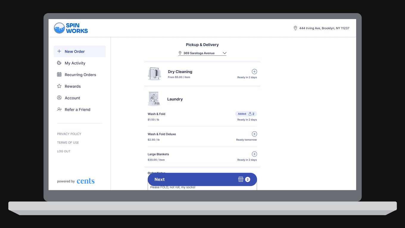
I collapsed the three scheduling screens; pickup time, delivery time, and recurring order, into a single page with smart defaults. Instead of asking users to make three separate decisions, the flow presented sensible defaults they could adjust. The recurring order prompt was removed as a popup entirely and became a simple toggle, with any applicable discount shown inline.
Roughly 40% of users complete their order without ever touching the time selector, meaning the default works for them out of the box.
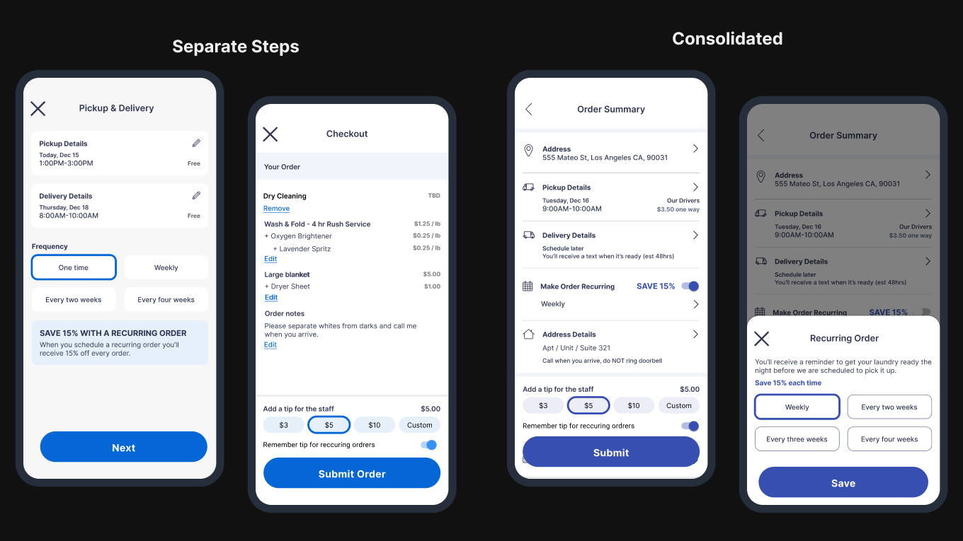
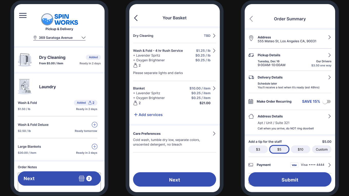
The Cart Overhaul
The most recent and significant change was introducing a cart page and multi-service selection. This wasn't adding a step, it was reorganizing existing information into a mental model users already understood from food delivery and e-commerce. Information that had lived across multiple screens was consolidated into a familiar cart experience.
Multi-service selection was also a meaningful product expansion, and part of a broader effort to redesign the service model for flexibility and scale. Because Cents is a white-label platform, operators structure their businesses in different ways. Building a system that could accommodate more business models means more operators can offer the high-value services that drive the most revenue. Pickup & Delivery orders are the highest-grossing order type for both operators and Cents. Enabling customers to add multiple services in a single order drives more revenue per transaction, which compounds across a growing operator base.
This overhaul was validated through AI-moderated user testing sessions via Strella before launch. All 7 participants easily completed every task.
“I would say it was seamless. Everything was there that I needed to do.
“I can't imagine it being much simpler.
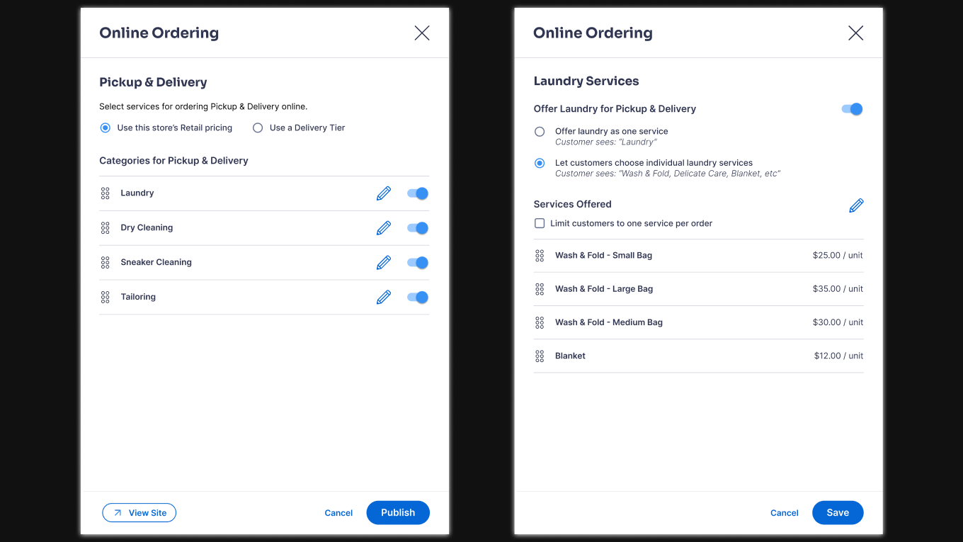
The Full System — Operator Configuration
Because the Cents B2C experience is a white-label platform, no two operators run their business the same way. Some offer pickup and delivery only. Some offer in-store services. Some have complex pricing tiers, custom service categories, and specific scheduling windows. The consumer ordering experience is only as good as the configuration layer behind it.
I owned and redesigned the operator-facing configuration tools in parallel with the consumer experience, building flexibility into the system so operators could structure their services the way their business actually works, rather than forcing them into a rigid template. This also included a vision for scaling the service model to accommodate more business types over time, which directly supports Cents's growth as a platform.
Designing both sides of the system meant every consumer-facing decision had to account for operator configurability. That constraint made the design work harder and more interesting; the kind of systems thinking that doesn't show up in a single screen.
Outcome
The ordering flow went from 6 steps to 3. The flow was redesigned to match how users think. Disruptive patterns were removed. The cart overhaul shipped with user testing validation. The operator configuration layer was redesigned for flexibility and scale.
Conversion improvement was the goal throughout; reducing time in the funnel and removing decisions that created drop-off. Data showed that roughly 40% of users completed their order without ever changing the default time, validating that the auto-schedule approach was working. Early data showed a meaningful jump in conversion following the cart overhaul, though we're still validating the numbers given variability in the comparison window. Qualitatively, the story is consistent: fewer support complaints about the ordering flow, positive user testing results, and an experience that finally matches the quality of the underlying product.
Looking Back
The biggest thing I'd do differently is push for instrumentation earlier. Making decisions without conversion data is manageable (good UX principles and customer feedback go a long way), but having numbers would have made every argument for change faster and easier to win. Getting tracking in place early is something I'd advocate for on day one at any new company.
Looking Forward
The roadmap ahead is focused on depth and retention:
- —Continue exploring more complex business models and ways to drive higher revenue per order
- —Enhance customer retention through features like the loyalty program
- —Improve the in-store self-service experience, which has historically received less design investment than the ordering flow
- —Develop a white-labeled native mobile app that features this ordering experience, as well as the in-store experience
Reduced a 6-step conversion funnel to 3 steps by reordering the flow around user logic
40% of users complete their order without touching the time selector — validating the auto-schedule defaults
Cart overhaul shipped with Strella user testing validation — all 7 participants completed every task
Early data shows a meaningful conversion lift post-cart overhaul; operator configuration redesigned for flexibility and scale